Ric
-
Posts
12128 -
Joined
-
Days Won
324
Content Type
Profiles
Forums
Gallery
Events
Everything posted by Ric
-
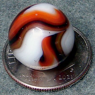
Nice Akro, I'm leaning more Carnelian than Cherry Ade. The last one is a Peltier, or dare I say, maybe a . . .
-
Peewee Pics Anyone? And a Little Info Would be Great!
Ric replied to Marbleized's topic in General Marble & Glass Chat
Thanks for the info! I knew you'd know more about these - they really are amazing JABOs. Thanks for the pics too. These marbles are off the hook! -
This is a good looking marble, and I don't really recognize it, but I think it might be a really nice JABO.
-
I do think the first marble might be Christensen but I don't think it would qualify as a Snotty. And the second marble looks like an Alley to me.
-
Peewee Pics Anyone? And a Little Info Would be Great!
Ric replied to Marbleized's topic in General Marble & Glass Chat
The bottom corners are not peewees . . .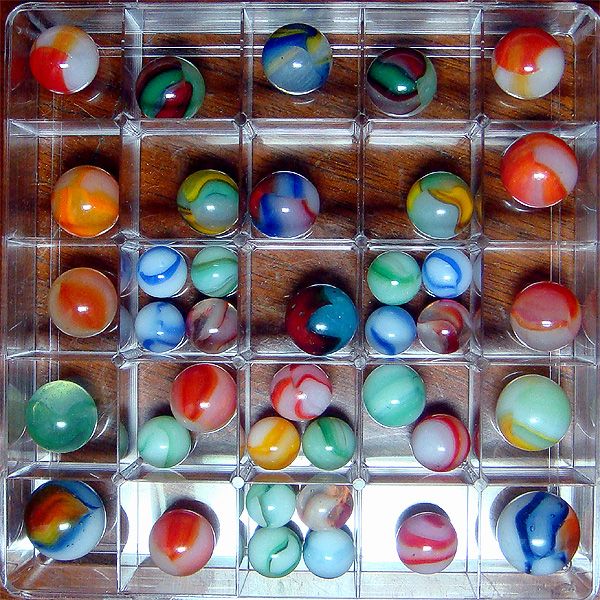
-
You sure those aren't old fashioned Vacors, Bill?
-
Yup.
-
I messed up this post!
-
Nice wee one, Dave. I'll stick with the peewee theme - this one is 7/16". And I'm getting close to the end of my German hand-mades too.
-
I think the darker vs brighter greens is one of the distinctions between Navarre and Barberton production, but I could certainly be wrong about that. Hopefully, someone with more knowledge than I will chime in.
-
I think you found yourself a very nice early American marble, Tommy - single pontil. All I can think of is Navarre. It's a keeper, for sure!
-
From my paltry collection of German marbles . . .
-
The mint green is great! Wow, another super board!
-
@schmoozer should do it! Just know that if the topic title says CAC, I'll be posting Champions . . . 😜
-
The way the forum works can take a little getting used to but it'll be worth it in the end. You and your boys will learn a lot about vintage marbles and you will introduce them to a very fun hobby that they could enjoy for a lifetime. Thanks for your persistence!
-
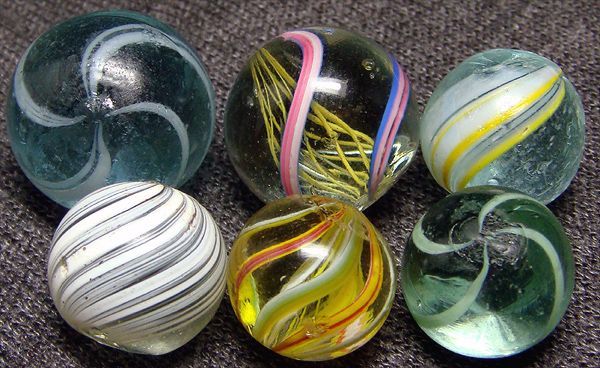
Maybe I can get you started and save you some time. Marbles 3 & 6 in the second row of your last picture are one of the most common vintage marbles you'll find (#4 in that row is just an odd one). They were made by Vitro shortly after the second World War and are referred to as Conquerors. You have lots of them in your collection. They have white glass, that appears to be painted on, covering about 2/3 of the surface of the clear transparent glass body. The other 1/3 of the marble has colored glass patch on the surface. You will also notice that they have two "seams" on opposite sides of the marble. The surface patch can be one of many different colors. Hopefully, you will now be able to go through your collection and pull these out.
-
That's a dandy marble, Tommy!
-
N Nice ones, Tommy. Keep an eye out for AV in the green ones like that - you might get lucky!
-
Sounds like a winner!
-
You could just title each topic Help Amber 1 Please, Help Amber 2 Please, etc., or something similar.
-
Not a bad layout but waaay too many marbles, Amber. To tough scrolling up and down and trying to keep track of which picture, which row and which column. Please post only 8-12 marbles in each topic. In other words, start a new topic (not a new post) for each group of 8-12 marbles. The multiple views are great though. I want to help but this sort of post make it too difficult.
-
Not CAC (Champion Agate Co. or Christensen Agate Co.). Most likely Alley. 😁
-
I suggest February 29, 2024. 😁
-
My favorite peewee for my favorite day . . . wee multicolor Alleys are VHTF.