

Ric
-
Posts
12128 -
Joined
-
Days Won
324
Content Type
Profiles
Forums
Gallery
Events
Everything posted by Ric
-
Thank you for the recommendation, Alan, I got the last copy in stock and I have a feeling I will really enjoy it!
-
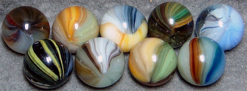
@Alan All of these marbles came out of the same Indiana collection and I am pretty confident that the middle row, and likely some others, are by Joe St. Claire, although certainly not his best work (look at that bubble on LBJ and how off center that little weevil figure is). On a more general topic, do you know of a good reference book for art glass marbles/makers?
-
Thanks for the input, Alan, I can guarantee that your guess is better than mine!
-
I find the bird-like surface patch over the clear on this particular marble interesting. Especially, in light of this post I made earlier in the ID section.
-
Wow, that's a great collection! Thanks for sharing it. No doubt it will serve as a good reference post!
-
I agree, and I think a few of the marbles in it deserve a little more attention.
-
One of Block's books, I think.
-
I think there is lots of contemporary millefiori out there and the marbles you are referencing are antique and far less common. My suggestion is to tread cautiously.
-
Man, am I glad you showed up!
-
Al, I am so glad you were able too finally get together and see it - fabulous is a pretty tame description!
-
I am obviously wrong about the color, so maybe Barberton - pontil looks melted to me.
-
I must also say, much of my knowledge of Vitro marbles, and my affection for them, comes from Chuck B., without whom, I never would have been able to pull this one from a pile.
-
Well, I am glad that worked out as expected. A couple of years ago I had to convince brother Bill that this marble wasn't a Pelt or an Akro before he'd let go of it, and I sure didn't want to give it back!
-
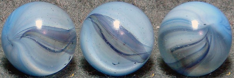
I am with you! It's the only company where I have seen all of these colors. As requested - one seam is a bit odd. You were on it early, Joep, but I think this Vitro is from Vienna.
-
I would go along with Navarre. The only other possibility I can think of is Barberton and I don't think this color is right for them.
-
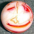
My first yellow latticinio has arrived
Ric replied to Chris Parson's topic in General Marble & Glass Chat
Hope you don't mind the edits, Chris, you've got to look close at this marble . . . It's a seriously cool core, so fine, almost like a ghost latticino, there are more filaments than first catch the eye, for sure.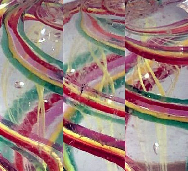
-
That's exactly how I remember them!
-
He's the guy I got that nice Norland box from!
-
Leave it to Steph - I so remember this now that you bring it up!
-
I am with you!
-
Now you're just toying with me . . . and you know I'm an odds guy. Yeah, Steph, notice the "s" on that "odds" too!
-
I appreciate the input folks, please keep it coming. It seems we are all in agreement . . . It's not a WV Swirl. 😊
-
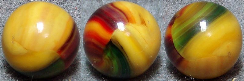
There are a bunch of nice Vienna marbles in this post!
-
My first yellow latticinio has arrived
Ric replied to Chris Parson's topic in General Marble & Glass Chat
It's a nice one! -
Excellent photography, as usual. That last one is really cool!


